Fairchild Tax Services
A tax practice that needed to answer the same questions once
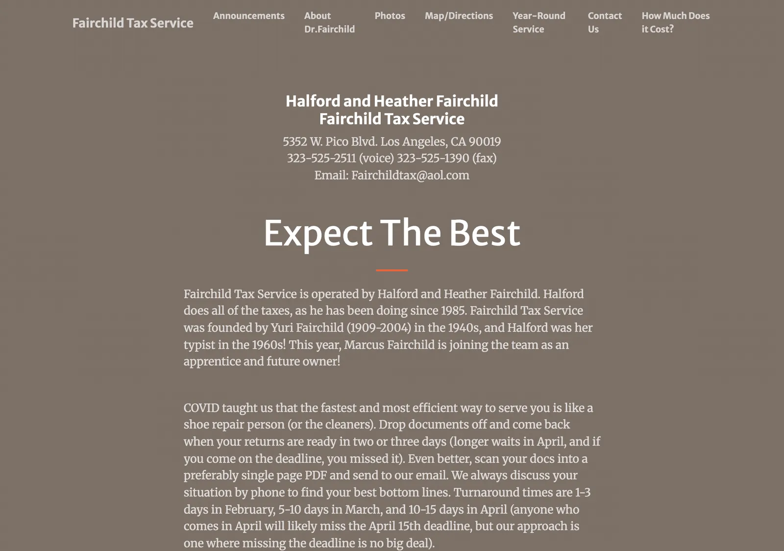
Fairchild Tax Services is a small Los Angeles tax practice. Most of its new clients arrive with the same handful of questions, and most of its phone calls were spent answering them.
- Design and build
- 2023–2024
The problem
A tax practice has a brutally seasonal business and a narrow set of questions it gets asked over and over: what do you charge, what do I need to bring, where are you, are you taking new clients this year. Every one of those answered on the phone is time not spent on returns.
The site needed to answer them before anyone picks up the phone — and it needed a way to post a notice at the top during filing season without waiting on me.
The approach
One page, in the order a prospective client actually needs it:
- A notice slot at the top for time-sensitive messages — deadline changes, whether the practice is accepting new clients, holiday hours. This is the part of the site that changes most and it’s deliberately the easiest thing to edit.
- “How much does it cost?” as a real section rather than a “call for a quote.” Publishing pricing filters out mismatched enquiries before they become phone calls.
- “At your service” — what the practice actually does, in plain terms.
- A map and contact details, because a local practice lives and dies on people being able to find it. The Google Maps embed is pinned to the business listing rather than a dropped pin, so it matches what people see in search.
- A contact form that sends an enquiry straight through, with the fields needed to triage it.
On being honest about the build
This one started from a Bootstrap template rather than from scratch, and that was the right call. The client needed a credible, working site inside a tax season, on a small budget. Starting from a solid template and spending the time on content, pricing clarity, mobile layout and the maintenance story served them better than a bespoke build would have at that price.
Knowing when a project doesn’t need a custom front end is part of the job.
One thing I’d fix
The footer still credits a domain I no longer run, which now resolves nowhere — a good reminder that live client sites need an occasional link audit, not just a launch. It’s on my list.